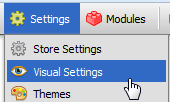
The Visual Settings page is used to control certain aspects of your storefront.
Opening the Visual Settings Page
- Open the control panel
- Click the Visual Settings menu link
Overview
General Settings
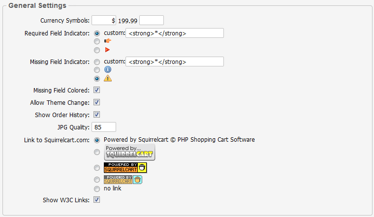
Currency Symbols
These fields control the currency symbol shown before and/or after your prices.
Examples:
$199.99
$199.99 USD
$199.99 CAD
£199.99 GBP
€199.99
Required Field Indicator
This field controls the appearance of the required field indicator on your address and product forms. It indicates to the customer that a field is required.
Missing Field Indicator
This field controls the appearance of the missing field indicator on your address and product forms. It appears after a form has been submitted, to indicate to the customer that a required field is missing or invalid.
Missing Field Colored
If checked, any required field that is missing when a form is submitted will have it's background color changed to indicate that it is incomplete. The color used is controlled via the .error_field class selector in style_main.css.php.
Default Theme
This is the theme that users will see when they use your store. Themes are a way of customizing the look of your cart. They are located in the "squirrelcart/themes" folder. See theCustomizing > Themes section for more information.
Allow Theme Change
When this field is checked, your customer's can change the theme for their account only, using the theme drop down in "Account Options". If you wish to disable this functionality, uncheck this field.
Show Order History
This field controls whether or not customers will see the "Order History" link in the account options after they login. If you check this box, they will see the link. If you uncheck it, they will not.
JPG Quality
This field controls the quality of the JPG files created when a JPG is manipulated in Squirrelcart. The default value for this field is 85, which generates a JPG with 85% of the quality of the original. The higher you make this number the better the JPG will look, and the bigger the resulting file will be.
Link to Squirrelcart.com
This field controls the appearance of the link back to Squirrelcart.com at the bottom of your cart page. You can remove that link by selecting no link
Show W3C Links
W3C links are added to the bottom of your storefront page by default:
They are used to indicate that your website complies with the XHTML 1.0 Transitional and CSS 2.1 web standards. They can be clicked to validate your XHTML and CSS. If you would like to remove these links, uncheck the Show W3C Links field.
Products (General)
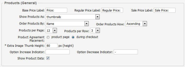
Base Price Label
This value should be text or HTML that you want to display before the base price of an item in the cart, when it is not on sale.
Regular Price Label
This value should be text or HTML that you want to display before the regular price of an item in the cart. This is usually shown crossed out, and above a product's "sale price".
Sale Price Label
This value should be text or HTML that you want to display before the price of a discounted item in the cart.
Show Products As
This field controls how products will appear by default when a category is clicked. The setting can be overridden at the category record level.
Products per Page
This determines the number of products that will be shown per page in the storefront. This can be overriden on the Category record.
Products per Row
This determines how many products will be shown per row in the storefront. This can be overriden on the Category record.
Order Products By
This is used to specify the field that will be used to sort the products for display when clicking on a category link. This can be overridden on the Category record.
Order Products How
This is used to specify how the products will be sorted, Ascending or Descending.
Previews per Page
If you are using the product preview feature, set this number to the number of items you would like to have displayed in the product preview. This is the navigation that is displayed by default to the right of a product's detailed description, and lists links and thumbnails for other products in the category, for easier navigation.
Previews per Row
This controls the number of products seen per row in the category preview navigation block.
Product Agreement Placement
This controls where sales agreements assigned to products will appear.
Extra Product Image Thumbnail Size
When assigning "extra" images to product records, this setting controls the size of the thumbnail versions of those images
Option Increase Indicator:
When a product option increases the base price of a product, the contents of this field precede the price shown for that option. If you wish to use this, you could enter "+" or "add" in this field.
Option Decrease Indicator:
When a product option decreases the base price of a product, the contents of this field precede the price shown for that option. If you wish to use this, you could enter "-" or "subtract" in this field.
Show Product Data
This controls whether the Product Data section will appear on your product detail pages. By default, this section will appear under Additional Information, whenever at least one product data field is specified on a product record. Product Data includes fields like SKU, Product Code, Condition, Model No., etc....
Products (New)
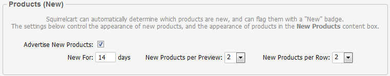
Advertise New Products
When checked, new products will be shown as "new" in your storefront.
New For
This field is used to specify the number of days to consider a product New.
New Products per Preview
This field controls how many products will be displayed in the "New Products Preview" section of your homepage.
New Products per Row
This field controls how many products per row are displayed in the "New Products Preview" section of your homepage.
Products (Search Results)
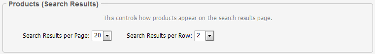
Search Results per Page
This is the default value for number of products to show on a single page of search results.
Search Results per Row
This controls the number of products seen per row in search results.
Products (Preview)
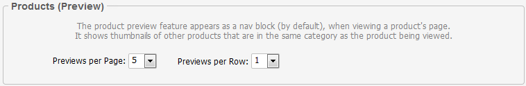
Previews per Page
This controls the number of product preview thumbnails that will appear for any given category, when viewing a product.
Previews per Row
This controls the number of products seen per row in the category preview nav block.
Products (Also Ordered)
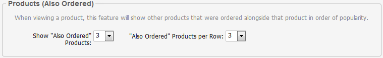
Show "Also Ordered" Products
Set this to the maximum number of "Also Ordered" products you wish to show when viewing a product in the storefront. (see this page for more info)
"Also Ordered" Products per Row:
This controls how many "Also Ordered" products will appear per row. (see this page for more info).
Products (Related)
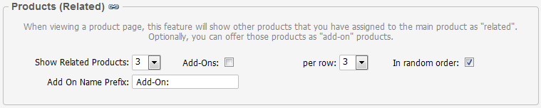
Show Related Products
Set this to the maximum number of related products you wish to show when viewing a product in the storefront. (see this page for more info)
Add-Ons
When checked, all related products will appear as add-on products by default.
(Add-Ons) per row
This field only appears when Add-Ons is checked, and controls the number of add-on products that will appear per row when viewing a parent product's page.
Add-Ons Have Qty
When Add-Ons is enabled, this controls whether the add-ons will have their own quantity fields.
In random order:
When checked, related products will appear in random order on a product's page. (see this page for more info)
Related Products per Row:
This controls how many related products will appear per row. (see this page for more info).
Add-On Name Prefix
This text is added before the product name in all checkout and order views to identify a product as an add-on.
Categories
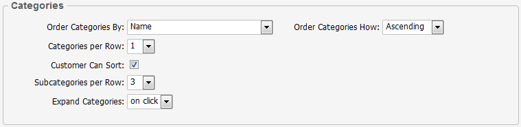
Order Categories By
This is used to specify the field that will be used to sort the categories for display.
Order Categories How
This is used to specify how the categories will be sorted, Ascending or Descending.
Categories per Row
This field controls how many top level categories will be shown per row in the Product Catalog content area of your storefront page.
Customers Can Sort
Checking this field allows customers to sort products when viewing a category that has 3 or more products.
Subcategories per Row
This determines how many subcategories will be shown per row, when viewing a parent category.
Expand Categories
This field controls when (or if) parent categories in the Product Catalog navigation are expanded to show the subcategories beneath them. This section appears to the left of the page by default.
The default setting for this field is 'on click'.
Breadcrumb Navigation
Breadcrumb navigation gives you a way to follow your path back through previous pages.
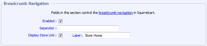
Enabled
This enables/disables breadcrumb navigation.
Separator
This is the text or HTML that you want to use to seperate each link in the bread crumb navigation.
Display Store Link
When checked, the first link in your breadcrumb navigtion will be to your store's home page.
Label
When Display Store Link is checked, this controls what label will be used for the link to your store's home page.
Cart Preview
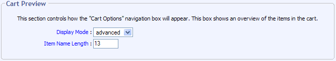
Display Mode
This field controls what will appear in the "Cart Options" navigation box.
If set to "simple", a message will appear to indicate how many items are in the cart, and the total.
If set to "advanced", a breakdown of the items in the cart will appear, with links to change the items.
Item Name Length
This field controls the number of characters from the product name that will be shown before it is truncated. The default value is 13.
Checkout
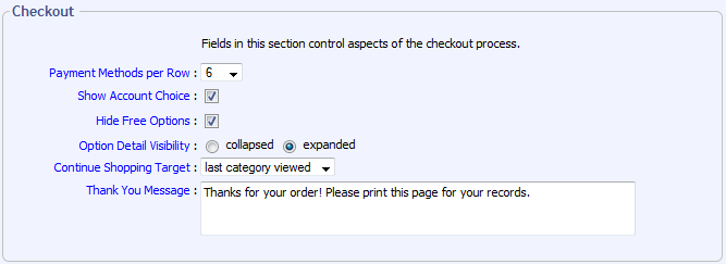
Payment Methods per Row
This field controls how many payment method icons will appear in each row.
Show Account Choice
This field controls whether or not the account choice page is shown during checkout. This page offers the customer 3 choices:
- New Account
- Existing Account
- Skip Account (not shown when "Force User Creation" is on)
Hide Free Options
Checking this field causes options that have no cost to not show up in the price breakdown during checkout.
Option Detail Visibility
This controls the default visibility for the option detail section on line items in the checkout, order detail, and HTML order emails.
Continue Shopping Target
This field controls what happens when the Continue Shopping button is clicked.
Thank You Message
This message appears on the thank you page after a customer places an order
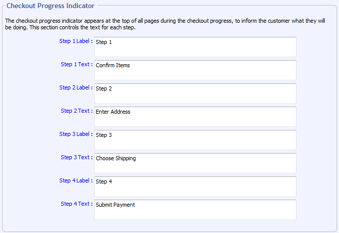
Checkout Progress Indicator
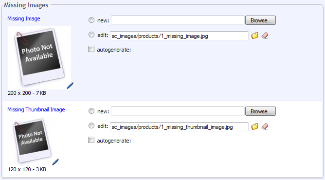
Missing Images
The 2 image fields in this section are used when showing products that do not have images assigned to them.
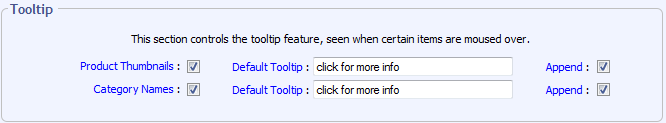
Tooltip
© 2001-2015 Lighthouse Development. All Rights Reserved.